Featured Work / The Bel
The Bird’s The Word
CLIENT
GW Properties
PROJECT
The Bel
AGENCY SERVICES
Branding
Outdoor
Web
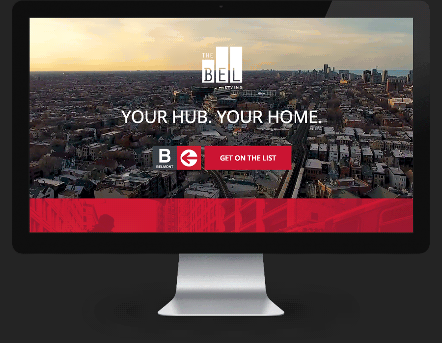
Approached by GW Properties to oversee marketing of their new luxury rental building in the heart of Lakeview’s transportation corridor, The Kno was tasked with naming, branding, and the development of all digital assets for what would be known as The Bel.
Situated directly next to the Belmont “L” train boarding platform, The Kno chose to embrace the location, incorporating it into the overall branding of the building and converting the platform-side of but building into a marketing opportunity of epic proportions.
The final Bel branding captured an iconically urban look and feel associated with Chicago’s most recognizable transportation line while photography and drone video helped convey a local, transportation-focused genre. The Kno also incorporated the iconic “L” transit map into both print and digital assets.
Website development was clean and straightforward, following an urban theme, and focused on lead generation for the leasing team. Onsite signage was designed to drive a captive train platform audience to the website for registration, email drip, and retargeting campaigns. This comprehensive offsite/onsite brand exposure resulted in driving monumental traffic to the website starting the day after installation.


Featured Work / The Bel
The Bird's The Word
CLIENT
GW Properties
PROJECT
The Bel
AGENCY SERVICES
Branding | Outdoor | Web
Approached by GW Properties to oversee marketing of their new luxury rental building in the heart of Lakeview’s transportation corridor, The Kno was tasked with naming, branding, and the development of all digital assets for what would be known as The Bel.
Situated directly next to the Belmont “L” train boarding platform, The Kno chose to embrace the location, incorporating it into the overall branding of the building and converting the platform-side of but building into a marketing opportunity of epic proportions.
The final Bel branding captured an iconically urban look and feel associated with Chicago’s most recognizable transportation line while photography and drone video helped convey a local, transportation-focused genre. The Kno also incorporated the iconic “L” transit map into both print and digital assets.
Website development was clean and straightforward, following an urban theme, and focused on lead generation for the leasing team. Onsite signage was designed to drive a captive train platform audience to the website for registration, email drip, and retargeting campaigns. This comprehensive offsite/onsite brand exposure resulted in driving monumental traffic to the website starting the day after installation.